

HealthHub
Share your goals and achievements with your love ones
Duration
2 months, August - September 2024
About
HealthHub is an health tracking app for sharing your goals and achievements with your family and friends. The company strives on staying contemporary, trustworthy, humorous, and motivational so that users feel the most comfortable with their health.
My Role
Solo UI/UX Designer and Researcher
Goals
HealthHub's goal is to increase repeat usage and engagement between their users through a new messaging system. The app creates a motivational community where users are encouraged to attend classes and share those classes with others that will participate with them.
Design Process
01. Empathize
Research Questions
User Interviews & Key Findings
Personas
03. Design
Low Fidelity Wireframes
Style Guide
High Fidelity Mockups
Prototypes
User Testing
02. Develop
User Flows
04. Recollect
Challenges
What's Next
01. Empathize
Research Questions
What motivates users to repeatedly engage in messaging?
Are there any constraints in keeping track of messages?
Why do users stop engagement after three weeks of usage?
User Interviews & Key Findings
User interviews are crucial in the beginning stages as a way to learn more about the problem itself from a user’s standpoint and their pain points without making design decisions yet. Five participants between the ages of 18 and 34 were recruited based on their compatibility to health and fitness related information.
“What encourages you to stay on top of your health/fitness goals?”
Physical Appearance
Personal Progress
“What motivates you to talk about health/fitness with others?”
Asking Around
"If someone asks me "
Education
"I want to educate others around me about the benefits"
“Do you share any health/fitness app journey?”
Fitness
"Just for fun and see what workouts we're doing"
Strava
"We like to track our runs together and see what kind of routes we go on"
02. Discover
Personas
A persona was made to represent a fictional character that represents a user type from initial interviews.

03. Develop
User Flows
After gaining insight about the primary needs of the users, user flows were constructed to organize potential user interaction. The user flows will help you understand how users interact with a product and the steps it takes to complete a task.
Flow #1: Sign-Up For Class
Flow #2: Complete Message Request
Flow #3: Log Your Workout/Post Achievement
Below is an example of the user flow for Flow #3.
Running
→
Date
→
↓
→
Time
→
Message
Clubs
Fitness Categories
→
←
Home Page
←
Club Information
Confirm
Legend
Start/End
Process
Decision
04. Design
Low Fidelity Wireframes
After mapping out the user flows, I was able to sketch and create a layout of the screens. Building the low fidelity wireframes help better visualize the design goals of each screen.


High-Fidelity Mockups
After conducting usability testing and working through branding, I created high fidelity mockups.
Prototype
I created the prototype through Figma, focusing on the three essential user flows previously listed.
To view the full prototype, please click here.

→

Style Guide
Colors
#1B5299
Typography
Font Family: Hiragino San
#FC7753
#FB3640
#000000
#F2CD5D
#A5A5A5
#FFFFFF
Usability Testing
Key Insights:
Users were mainly concern with their profile page and how much information is shown to others. They wanted the profile to be more geared towards themselves with more purpose. We discovered that if someone has a specific goal, there must be an end goal reason that should be included in the profile. For example, if someone's goal is to be able to run xyz miles a day, is it because they are attempting a marathon in the future?
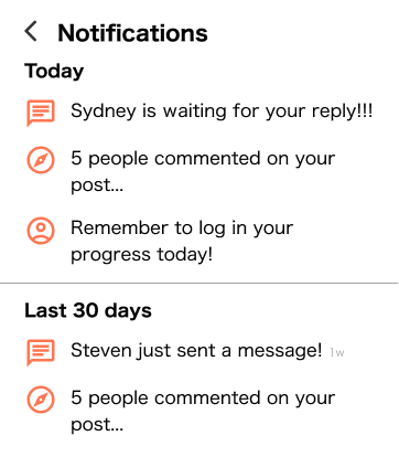
Users did not like how the notification system was used as almost a task function. Originally, the task that the app was giving including notifications were all in the notification button. In order to combat this, we utilized a bright green signal to allow users see that there are unread messages. Therefore, we kept notifications purposefully for notifying the user of any actions taken from others.


→


05. Recollect
Challenges
As I worked through the project, I struggled with creating new designs in terms of steering away from generic patterns. Through my interviews and usability testings, I learned how the generic designs sometimes are even better than creating something more complex than needed. For example, my messaging system follows standard blue text, but that also helps users connect as they already assocaited that blue with text bubbles.
What's Next
If this app were to be further developed, there would be additional features added based on the final user testing.
For example:
Steps/Distance Tracker
Achievement Badges
Daily Task Challenges